
Touchy is a premium mobile menu and header plugin for WordPress. Designed with smartphones in mind, it is quick, reactive and super comfortable to use. Next to having been tested thoroughly on different mobile devices.
Overview Touchy Plugin WordPress
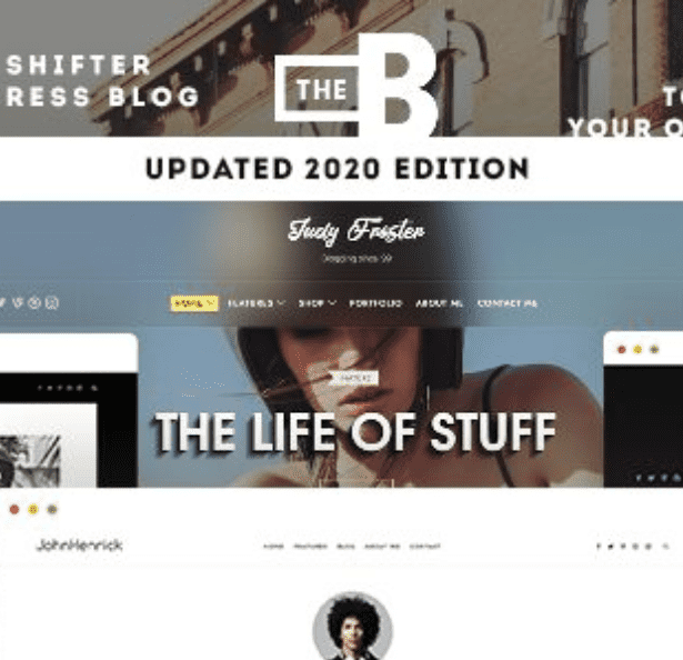
In today’s mobile-first world, having a website that works flawlessly on smartphones and tablets is crucial. Touchy addresses this by replacing your theme’s standard header with a sleek, fully responsive one. It provides a sticky header that stays visible as users scroll, combining your logo, a hamburger menu, call-to-action buttons, and contact information into a single, intuitive bar. It’s built for simplicity and performance, ensuring a smooth user experience without slowing down your site.
Key Features
-
📱 Fully Responsive Design – Automatically adapts to look perfect on all screen sizes and devices.
-
🍔 Customizable Hamburger Menu – Style the iconic mobile menu button and the slide-out navigation panel to match your brand.
-
📞 Click-to-Call & Click-to-Email – Add direct links for phone calls and emails, essential for local businesses.
-
🔍 Sticky Header – The menu bar stays fixed at the top or bottom of the screen for easy access at all times.
-
🛒 WooCommerce Integration – Seamlessly integrates a cart icon and link for your online store.
-
👁️ Live Customizer Preview – See all your changes in real-time within the WordPress Customizer before going live.
-
🎨 Extensive Style Options – Control colors, fonts, spacing, and icons to create a unique look and feel.
-
🔗 Social Media Icons – Easily add and link to your social media profiles directly from the mobile header.
Why Choose Touchy?
Choose Touchy for a no-fuss, highly effective solution to mobile navigation. It’s built with user experience and conversion in mind, offering essential features like click-to-call and cart integration without bloated code. Its ease of use within the native WordPress Customizer makes it accessible for beginners, while its customization options provide the flexibility developers need.
wordpress, plugin, mobile, responsive, menu, navigation, header, hamburger-menu, sticky-header, woocommerce, mobile-friendly, touch-friendly, call-to-action, lightweight


